HubSpot Growth design
Developer Platform Onboarding
- Role
- Senior Product Designer
- Other teams
- Engineering
- Product Management
- Developer Relations
- Marketing
- Growth Design
- Timeline
- 6 months
- Outcome
- Reduced time to activation from 1‑2 hours to 2 minutes
Summary
I evolved the onboarding and return experience for HubSpot third party developers, building a directional Home Page and sample app experience.
The problem
Too much information, too little direction.
HubSpot’s Developer Home Page and first time experience felt non-directional and unrelatable. Users complained about not knowing where to start, struggled to reach our target activation goals (an “aha” moment where they could see their CRM cards on the actual platform UI) and felt the Home Page had too much noise to be useful.
As the platform was still relatively new compared to the rest of the CRM, there wasn’t a lot of guidance or solidified understanding in the core user journey. Additionally, many teams had their hands on the Home Page in hopes of grabbing new users’ attention, creating an overload of information, but also a cobbled and nonlinear experience when a developer first landed in their portal.
One of the only things that was done to provide any sense of direction was a checklist, which customers had said was lengthy, cumbersome, and hard to make sense of. Additionally, when a user had finally gotten around to finishing their app card, the checklist would still stay on the home page, providing no actual return experience.
My role
I was the sole lead designer working in a small triad (just 1 product manager and 1 full stack engineer) on this project. The initial scope seemed like a light retouch of the home page; however, after talking to customers and multiple teams, I proved the project to be much larger than what had originally met the eye.
- 01 Researched the everboarding journey
- 02 Redesigned onboarding and return experiences
- 03 Sought buy-in from partner product teams to unblock ours
- 04 Brought GTM and marketing in to tailor messaging and positioning
User challenges
HubSpot’s Developer Home Page and first time experience felt non-directional and unrelatable. Users complained about not knowing where to start, struggled to reach our target activation goals (an “aha” moment where they could see their CRM cards on the actual platform UI) and felt the Home Page had too much noise to be useful.
-

Too much on the Home Page
Content had piled up over the years with little rhyme or reason, and developers were overwhelmed by it.
-

No clear first step
First-time developers had no clear direction for building something, and the messaging rarely matched where they were in their journey.
-

A mismatch between the UI and CLI
Developers built in the HubSpot CLI, but the getting-started checklist lived in the UI, so they kept switching screens and struggled to focus.
-

No follow-up after onboarding
Once developers finished getting started, we didn’t point them to what came next, leaving them asking “what do I do now?”
Core requirements
After distilling all the information and research from the breadth of teams and customers, I tiered the core requirements into priorities based on stage of onboarding. The more important requirements were to get developers started as quickly as possible, then be able to continue and monitor their work at a glance once they’ve finished onboarding.
First visit
- Users need to know where and how to start working on an app P0
- Users need to know how to get to the CMS P0
- Users need to know how to access Dev Docs P1
- Users need to explore examples of what they can build P1
- Users want to know about the latest features P2
Return experience
- Users need to see the state of their built apps and recent updates P0
- Users need to know their API usage P0
- We want to show users how to take their app to the next level P1
- We want to show users how to keep growing their knowledge P1
Because our team was so lean, I worked to get buy-in from other teams to assist building some of the features we wanted. Whether it was working with Developer Relations to create a dynamic list of new features, or local development to tweak and merge the new onboarding command into the HubSpot CLI, I made it a point to tie the onboarding journey together to be as streamlined as possible.
Key solutions
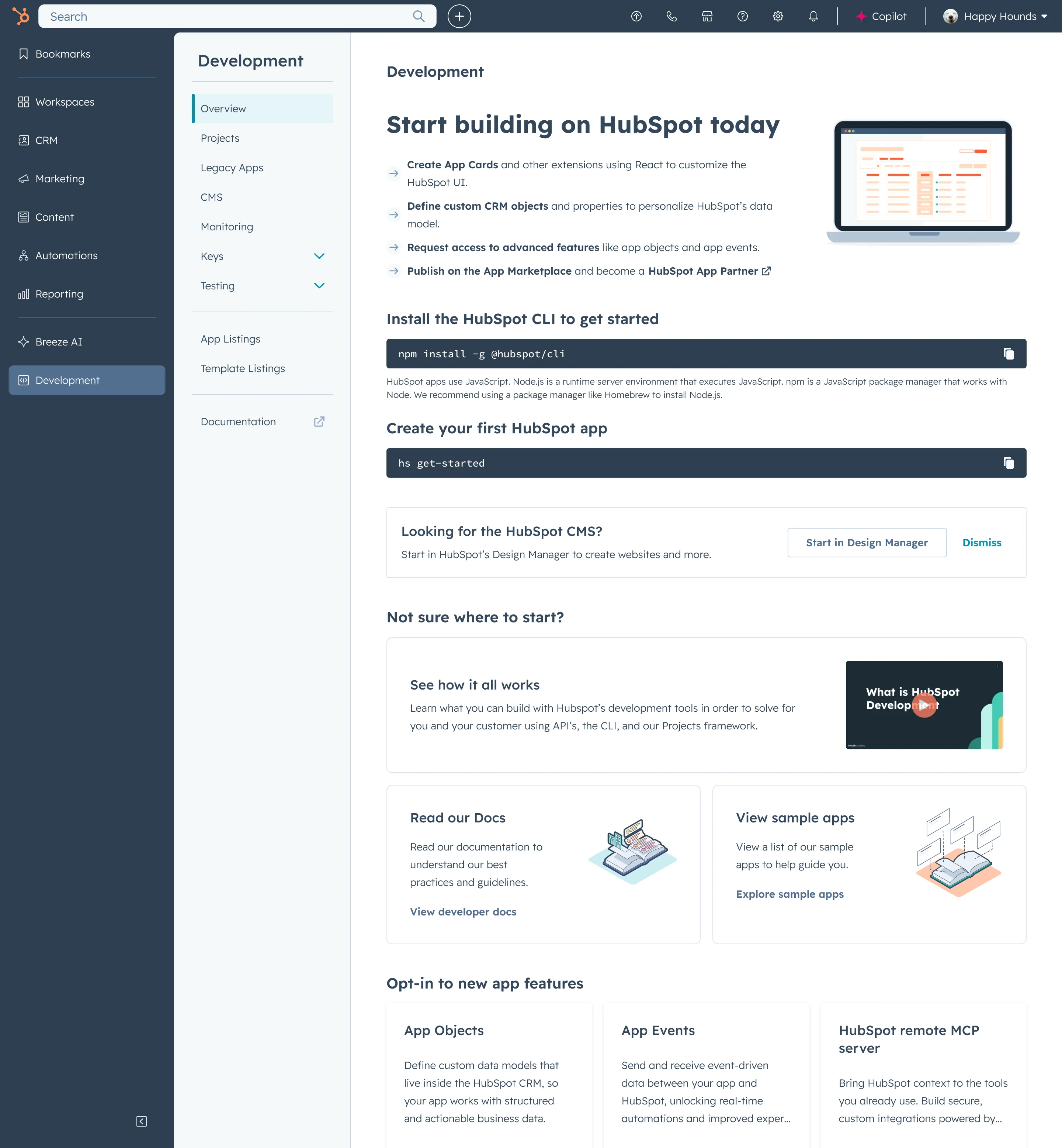
A Curated, Directional Home Page
The first priority was to create a home page that informed users about what they could do at a glance, then get them right into building.
One challenge was to manage the number of additional features other teams wanted on the home page — updates, new features and marketing opportunities were among the things I created space for in a way that made sense to the user from a hierarchy standpoint.
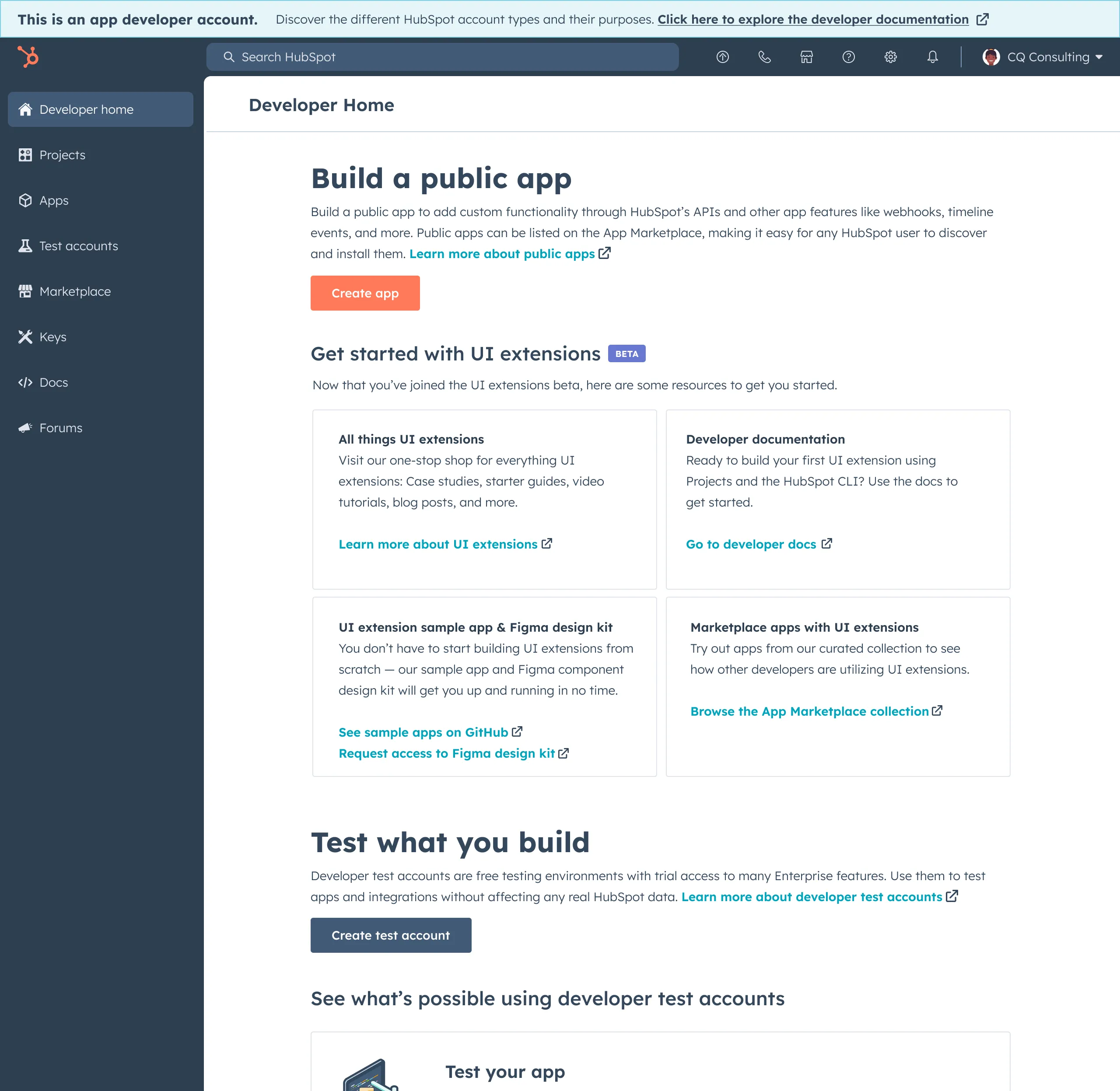
I worked closely with the core Developer experience team to define the return experience. We agreed that the most important thing that users wanted to see was their API usage and their recently worked on projects and statuses. I wanted to keep a high level, scannable snippet of each so that users could jump deeper into sections if they wanted to.
I also kept the same framework that I had in the first time experience, incorporating marketing updates, new features, and a way for developers to further their journey in HubSpot’s development platform to encourage everboarding and monetization. Most developers didn’t take this route, but we wanted to ensure they were aware of opportunities to adjust their apps to host on our Marketplace (as most were not aware this was possible).
Because only ~10% of developers ever got to this level (since more were hired by companies to build out apps specifically catered to that company’s use case), we wanted to keep the majority of the core experience relevant and tailored to them. Thus, I deprioritized the continuation of everboarding in order to keep our satisfaction scores up and our existing user base happy.
Home Page: First Time and Return Experience
Interactable Developer Home, First and Return experience
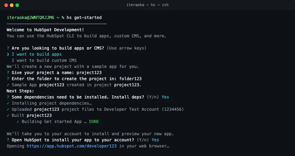
A New Command: hs get-started
Developers had expressed how much they want to simply live in the CLI (local development) rather than relying on the UI or navigating back and forth, and had preferred to learn the process of creating a HubSpot app card before exploring what they could do. I had initially thought of providing a more handheld experience incorporating a tighter integration with the UI; however, that didn’t test well. Our developers stuck to their preference for living in code, so we stuck by them by providing the guardrailed sample app experience where they were.

- 01 Run hs get-started in the CLI
- 02 Choose what you’re building — app or CMS
- 03 Scaffold the sample app locally
- 04 Set up and deploy your app in a test account
- 05 See your app card live in HubSpot
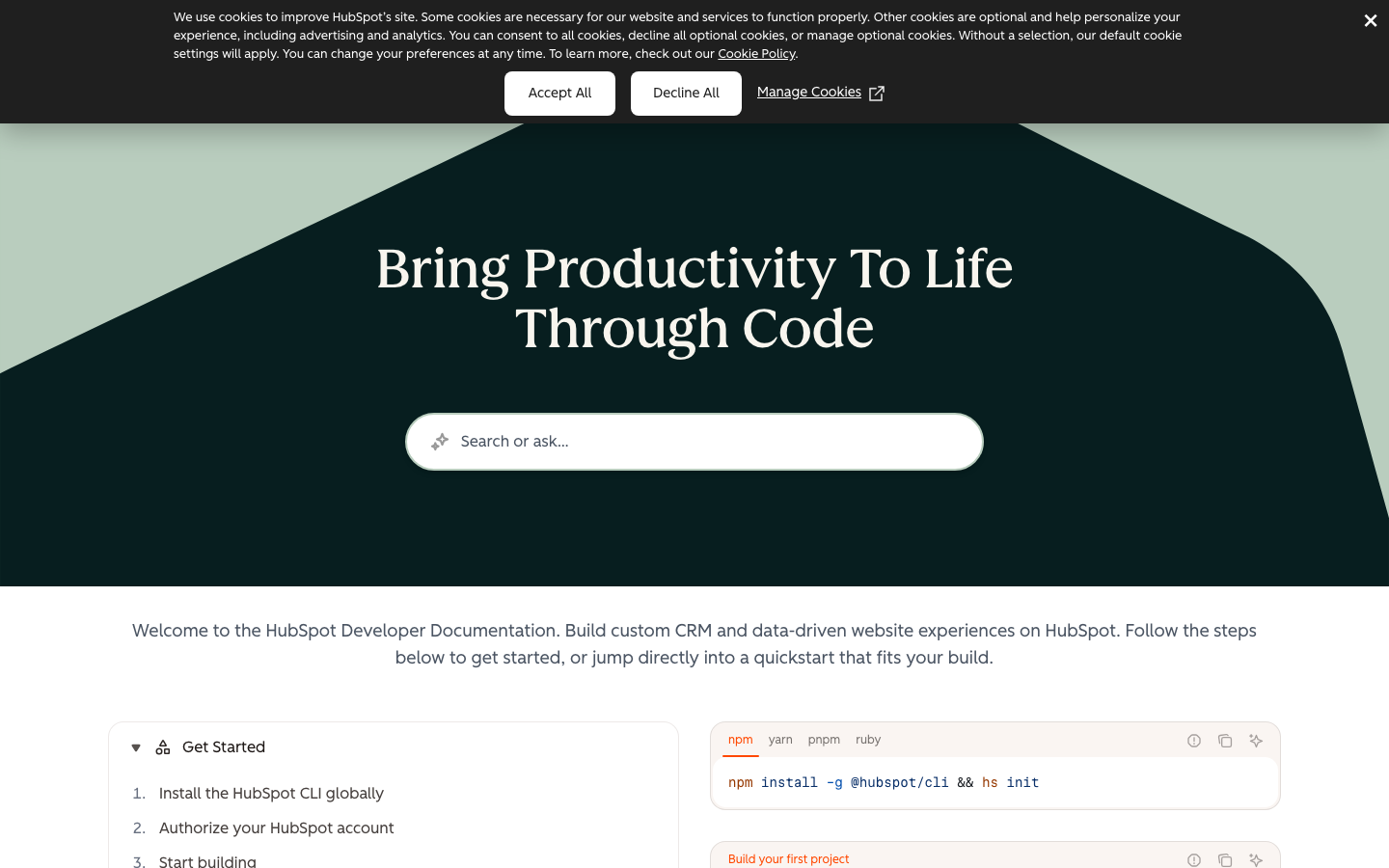
Migration of Developer Docs
Our team was severely lacking in resources. Barely able to maintain the home page and the developer docs site, we had to make a choice to migrate our docs to a third party platform (Mintlify), which had a team that could help us with better navigation, indexing, and support. In turn, that freed up our time to focus on other things — I designed template pages for the Mintlify team based on how I saw developers search and navigate through them on our previous site, making improvements and adjustments where necessary.
Outcomes
From hours to minutes
2 minutes average time to activation “aha” moment
Previous developers had told us that they used to take hours researching, scrolling and exploring just to get a basic app card live on their HubSpot instance. With the new Home Page directing them where to go and how to start, along with the new CLI command, new users didn’t have to be distracted by noise, and instead could focus on the process. The “aha” moment for them was when they were able to see their app card live on HubSpot, which sparked ideas of what they wanted to do next.
Rather than trying to inundate them with possibilities without showing them how to start, we pivoted our approach to show developers how the process worked. With that, they were able to understand the system, which in turn allowed them to start thinking of possibilities that we were then able to show — aligning our messaging and offering to them at the right time.
Reflection
The Advent of AI
During the project, the larger organization was exploring the possibilities of MCP servers. True vibecoding hadn’t fully been released, nor had Claude Code been a main tool for many just yet — we were on the cusp of being able to leverage it for the HubSpot CLI. This would have more easily allowed us to let developers explore and build at the same time, though I do feel that the initial guardrailed onboarding experience would still be necessary, as developers still need to understand how to deploy their app to HubSpot (though, being able to use AI in the CLI would greatly help and expedite a lot of potentially unnecessary steps).